


Emporix has an established management portal that is integral to its operations. However, the portal's existing user interface needs to be updated, and there is a pressing need to integrate new features to keep up with the dynamic business environment.
Scoured the digital commerce landscape, identifying emerging trends, competitor offerings, and areas where Emporix could distinguish itself.
Engaged in in-depth discussions with key stakeholders to discern their expectations and aspirations for the redesigned platform.
During the interview, participants pointed out a lack of consistency between the different modules in the portal, resulting in a jarring effect. Additionally, some key CTAs are not appropriately placed or labelled, causing confusion for users. Lastly, some users noted that the navigation takes up a lot of space on the screen.
With the increasing of features, groups needed to be created.
In addition to the user tests, I conducted a remote card sorting exercise with 20 users to understand better how to categorise modules.

Two versions of the navigation were tested in an unmoderated user test to determine the effectiveness of interactions for navigation, which allows the sidebar to be collapsed and expanded as needed.
Version A allows users to browse the menu sub-section while keeping the navigation in collapsed mode. The navigation can be expanded when needed, but its default state is collapsed.In Version B, the navigation expands when users click on a category.


Brainstormed numerous design concepts, progressively narrowing down to those that resonated best with Emporix's vision and goals.
Transitioned from rudimentary layouts to intricate, interactive prototypes, detailing every facet of the user journey and interface.


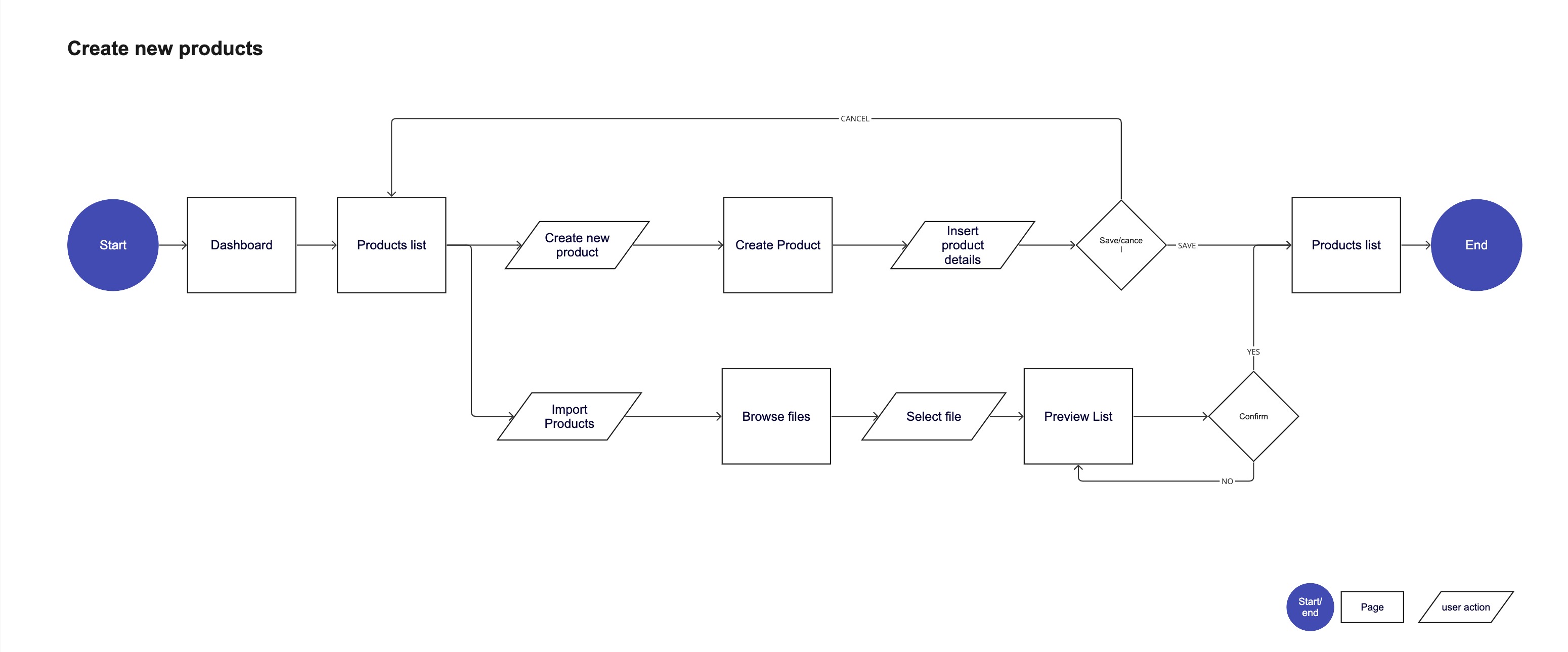
After aligning on the new solution with the team, I created user flows for the main tasks
(example: Create a new product)


The navigation has to reflect the increase in complexity of the dashboard. With new features added regularly, it needs flexibility, high usability standards, and to be future-proof.
I designed a navigation that can be collapsed to leave more space for the data-heavy screens. It still maintains full operational capability when in collapsed mode.
The expanded state of the sidebar allows users who are less proficient with the dashboard or who prefer an expanded version to browse content easily.
The sidebar is reserved solely for navigating through the dashboard.
Other actions, such as changing the tenant, currencies, language or managing the account information, can be performed by the bar on the top of the screen.

The existing portal was missing a landing dashboard. A user would start their journey directly in one of the modules. It would be beneficial to create a dashboard that lists all the primary information and offers and an overview of revenue and orders.
The dashboard is customisable, but the default version needs to be ready to use.
New users will see a section dedicated to onboarding. Initially, they will be able to customise their dashboard, and subsequently, they will be offered guides and tutorials on how to set up their account correctly. Following there is information about the sales performances. There's a breakdown of daily, weekly and monthly sales and a performance graph.
The bottom part of the page has information about the latest orders: orders breakdown and latest orders.

Intending to create consistency across the platform, I designed a standard module. This design allows every page to follow the same model, allocating specific positions for different actions.
I have created a scalable design system that covers all identified use cases for this project. Below are some of the responsive web components, based on the atomic design methodology.
