


The challenge
While the platform offered great content and value, we observed that new users tended to disengage shortly after signing up
While HealthKey offers a range of great health services, we observed that new users tended to disengage shortly after signing up. This project focused on improving the experience of new users, encouraging them to explore the platform further and engage with content and services that are more relevant to their needs.
This project addresses a specific issue: among new users who are employees with a budget and were invited in the past three months, only 8% made a purchase on the platform.
The goal of the project was to improve four key metrics:
I interviewed five professionals aged 25 to 60, who currently receive employee benefits through other platforms. Participants were presented with a scenario where, as new employees, they’d be invited to join HealthKey during their onboarding process.
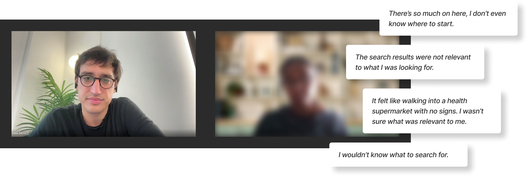
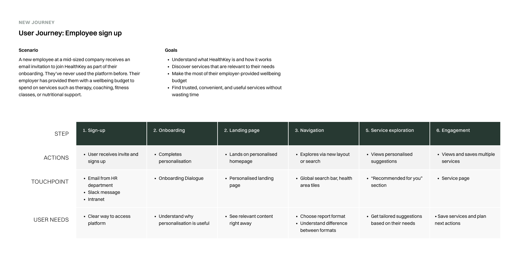
Using insights from interviews and analytics, I mapped the new user journey to identify friction points across onboarding and discovery.

Based on the research findings, I identifies 4 areas of intervention:
The revised journey map served as an alignment tool, helping the team define a shared vision for how the new user flow should feel and function.
It clarified the direction we wanted to move in. It highlighted where the design and product decisions could better support user needs across the journey.
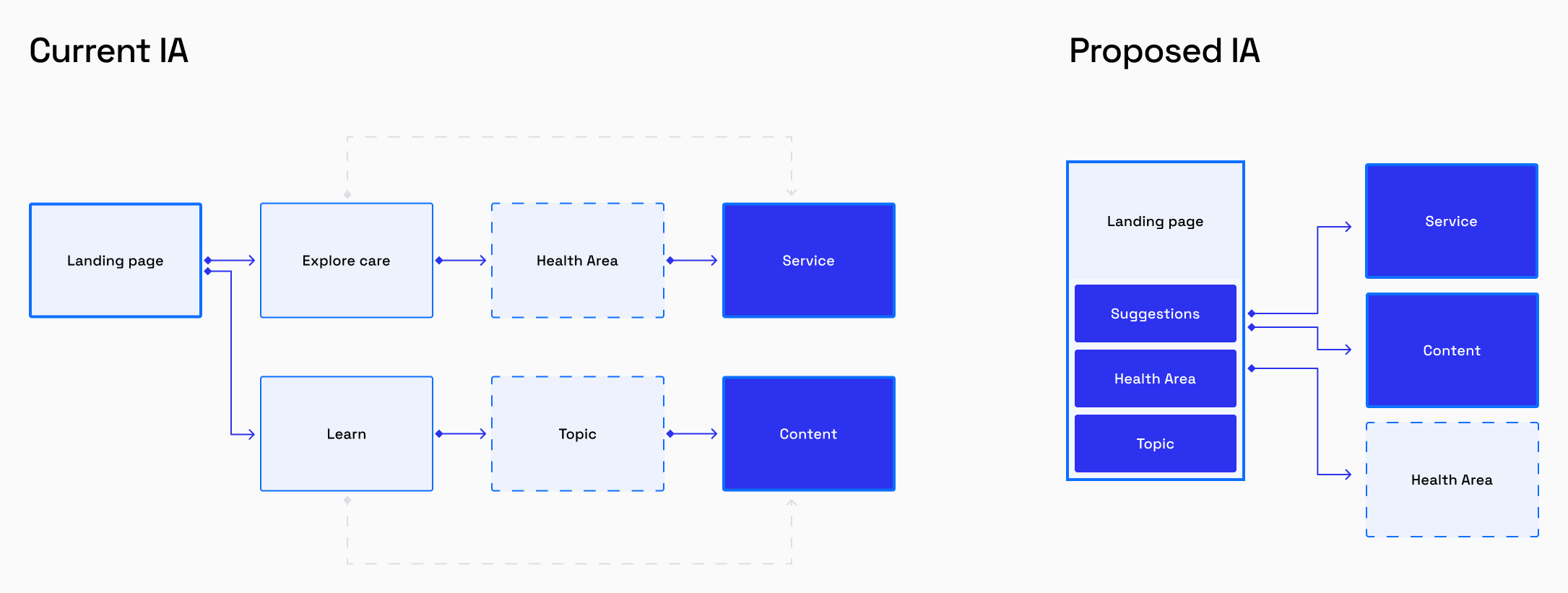
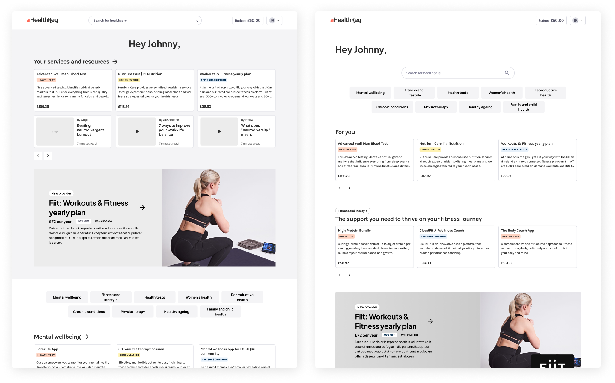
I consolidated discovery into a single landing page, centralising search, browsing, and personalised recommendations in one place.
I designed two landing page variants and tested them with users to validate the approach. The first emphasised structured category browsing with personalised recommendations, while the second focused on a dynamic feed that adapts to user behaviour over time.
I tested two landing page concepts with five participants each, and results showed that the personalised feed version was clearer, more intuitive, and encouraged deeper exploration.


We moved the personalisation questionnaire into the onboarding process, ensuring every new user sees it early and understand its purpose.


Replaced the old hub-and-spoke model with a single, dynamic landing page that adapts based on:
1. Information shared during onboarding
2. User behaviour over time
3. User type (users with budgets, users with pre-paid packages, etc.)

Gave search top priority, and introduced browsing by health category. This offered two paths: direct ( search), and exploratory (browse)

Designed reusable components to surface relevant content on services:

| Metric | Before | After | Change |
|---|---|---|---|
New users purchases Users who made 1 or more purchases in the first 3 months after sign up | 8% | 20% | +12%pts |
Personalisation completion Users who completed all steps of personalisation journey | 29% | 72% | +43%pts |
Bounce rate Rate of users who left the landing page without further engagement | 58% | 34% | -24%pts |
User engagement User who viewed 4 or more service or content pages | 25% | 39% | +14%pts |